Spotify
Adding a search and filter feature to allow users to find podcast content they love
Project Overview
The aim of this project is to add a feature that will enhance users ability to engage with podcast content in Spotify.
My focus is to improve the way that people search, curate, and organise their content so that it feels relevant to them. Improving the quality of recommendations, to surprise and delight users.
Podcast content is continuing to grow, and it is impossible for users to keep up with the ever-growing selection of content, and the additional features the app offers. Users want to feel that the content they see is selected for them, and speaks to them as an individual.
Project Details
Project Goals
The aim of this project is to design a feature that will enhance users ability to engage with podcast content in Spotify.
The User
People who enjoy listening to podcasts for personal and educational purposes. They are interested in learning and want to expand their minds by listening to new content.
User Problem
Spotify is great at serving up music that meets users needs, but when it comes to meeting user needs for podcast content discovery and recommendations it is lacking. Content is continuing to grow rapidly, and it is impossible for users to keep up and find what they want.
Users want to be able to find content that speaks to them without having to trawl through music and podcast content.
Business Problem
Spotify has invested over $1 billion in podcasts, and while it has generated $215 million in revenue they still need to increase listeners to ensure the can become profitable with podcasts.
The Solution
A feature that lets the user toggle between podcasts and music, and once in the podcast section they can filter for podcast shows and then filter for episodes within the show. This feature will allow users to find content, and as they build their preferences Spotify will be able to better tailor recommendations.
Landscape Analysis
There are a number of direct competitors for Spotify, most notably Apple Music and Podcasts.
One of the main things that came out of the research is that most of the others split podcasts away from music. This seemed to help create a sense of clarity and order to the content. Similarly if we look at indirect competitors like Netflix you can easily divide the search between movies and series, making it easier for the user to search for what they want. This mixing of content adds additional unnecessary cognitive load.
In terms of what users expect from these Apps it is clear that they want control. Yes they want recommendations, but they also want to be able to search, and find new content through their filters.
Understanding Users
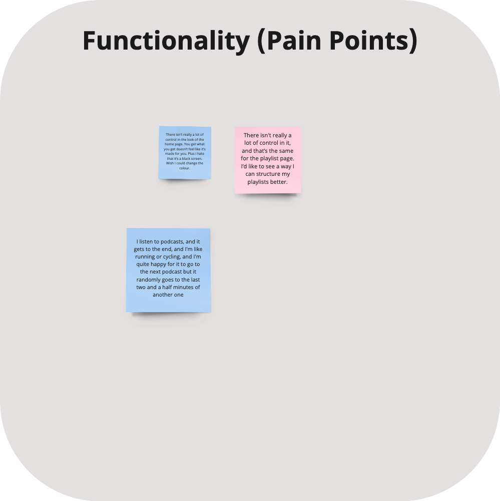
I conducted 6 users interviews some via zoom and others face-to-face for this project to understand the common pain points when trying to find new podcast content. It was helpful to interview a couple of users in person as they shared their phones to describe their pain points.
There were a few key themes that came out of the research, things like not feeling that they could trust podcast recommendations, or that they could search for what they wanted without getting music mixed in which was distracting.
Users found the way that podcast content was displayed to be confusing and as it was mixed with music content it was hard to find what they wanted.
They found it difficult to search in the episodes to get what they wanted and would just spend time scrolling to see what episode to listen to, which often felt like a waste of their time.
Persona
Building the persona helped me to keep the needs of the user in mind.
From the research it was clear that users had busy lifestyles, and wanted to listen to podcasts during habitual tasks like doing laundry or running.
It was also clear that users didn’t trust the recommendations on Spotify as they felt like they were being sold to, and that that the podcast recommendations were inaccurate.
One of the key things the research illuminated was that users needed to work to find a podcast, and even searching within an episode could be time consuming as they had to scroll until they found what they wanted.
Users listened to podcasts to learn, and while some listened for personal interest, all of the people interviewed listened to educate themselves.
Due to the fact that all of the users were in full time employment or study, their time was limited and podcasts provide them with an easy way to learn while on the move.
Empathy Map
In order to truly advocate on behalf of the user I wanted to create an empathy map that would allow me to deeply understand users. Furthermore this would allow me to prioritise the feature that best meet their immediate needs, and enhance their current experience of searching for podcast content.
A key theme that came out of the research was this lack of trust users had in Spotify’s ability to understand and anticipate there podcast listening needs. Users were sceptical about the content they were being shown, but found it hard to find relevant content in the app because all the content was mixed together.
How Might We
There were a few directions that I could have taken with the research findings.
I used a series of How Might We statements to help me refine my insights into opportunity areas and innovate on problems found during user research.
Based on the research I wanted to offer users a way to search and filter for content more easily, which in turn would allow Spotify to gather data that would better help predict and share relevant content to users. The fact that users didn’t search in the app, and often stuck with one podcast until it was finished meant that Spotify didn’t have enough data to present relevant podcast recommendations, and this is why users where being served up content that did not match their needs.
To get some initial feedback I shared my ideas in my group crit. I was able to identify a clear path forward, this was to combine idea 2 and 4 as a feature, that would improve users autonomy when searching for new podcast content.
Task Flow
From the interviews I was able to identify a task flow that represented a potential search process based on the new feature.
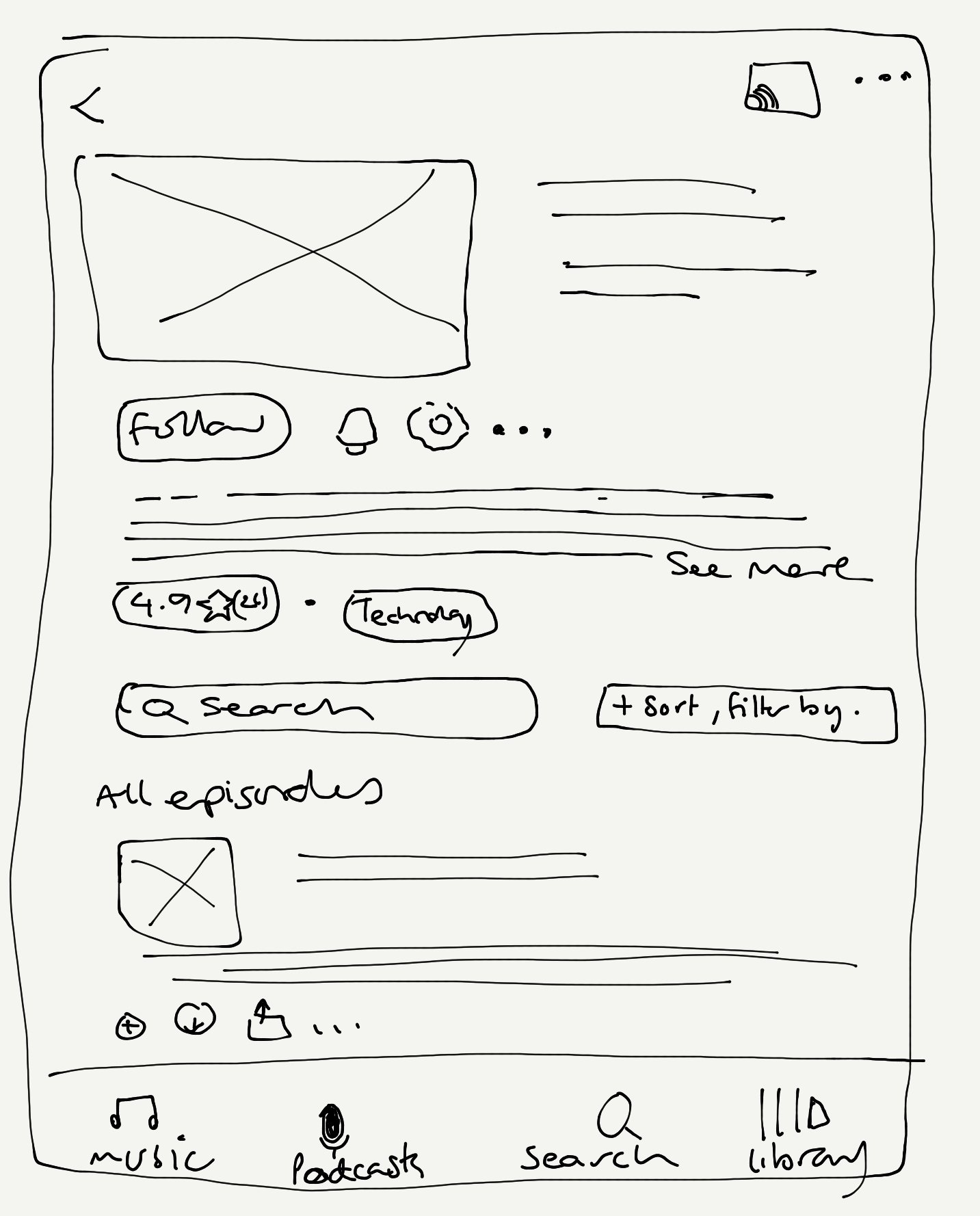
This new feature would allow users to search podcasts only and then refine form within the podcast show, which would open up new content for them based on their ability to drill down their search.
User Flow
Based on my research and observations of how people used Spotify, I wanted to create a user flow to show the potential journey that a user might take when going through the above task flow. What I noticed is that users would move between podcasts and music depending on in their mental state, and focus. I wanted to ensure that once they selected a podcast they could deepen the search and this process could be repeated until they found what they wanted.
I wanted to make sure that the design was intuitive and representative to the way that users engage with the search process. I also wanted to ensure that they were guided through the flow with as few actions as possible.
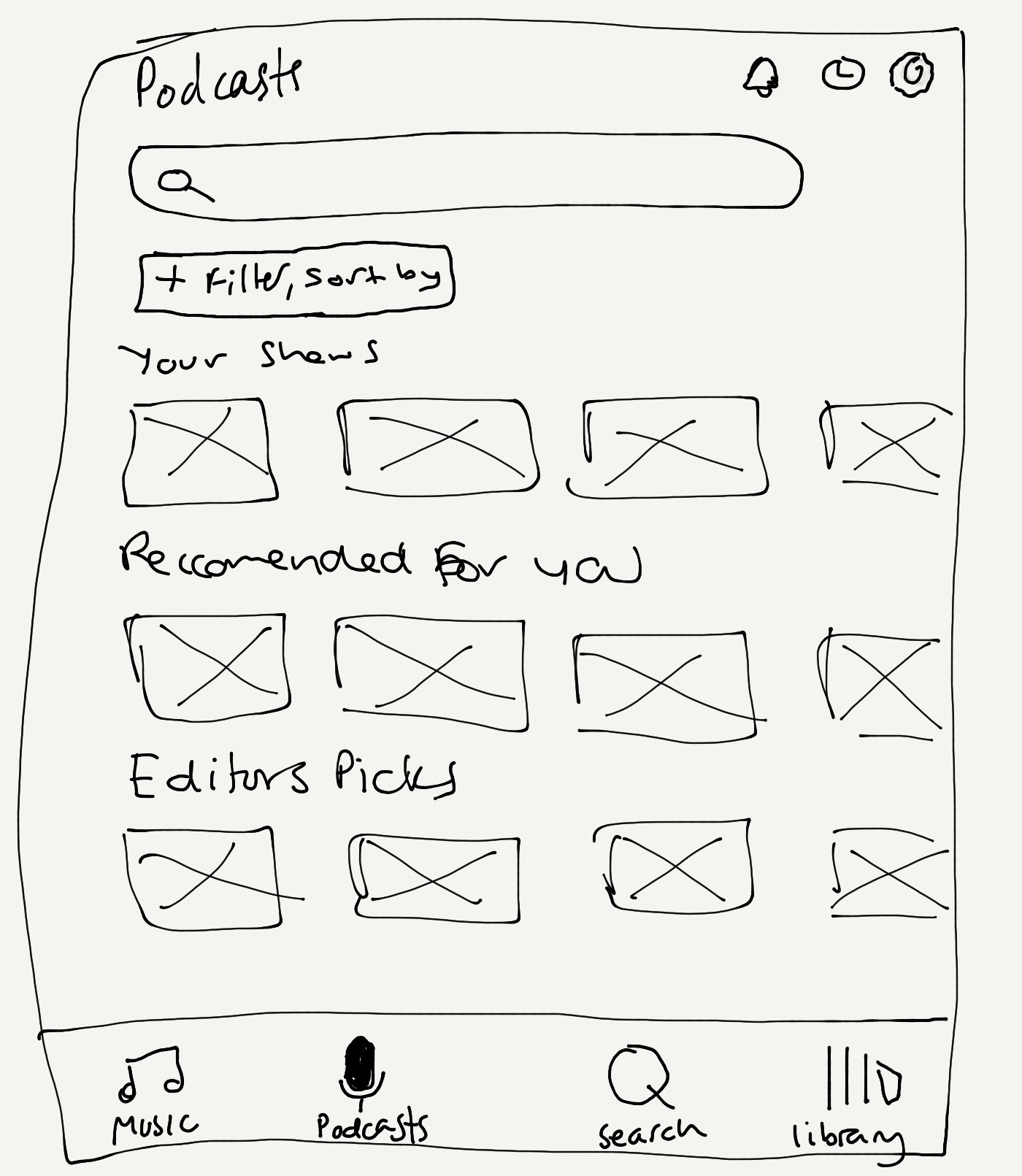
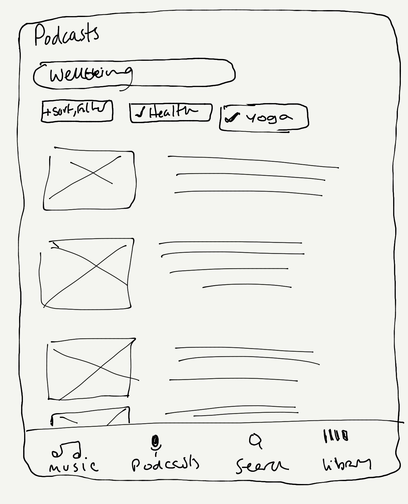
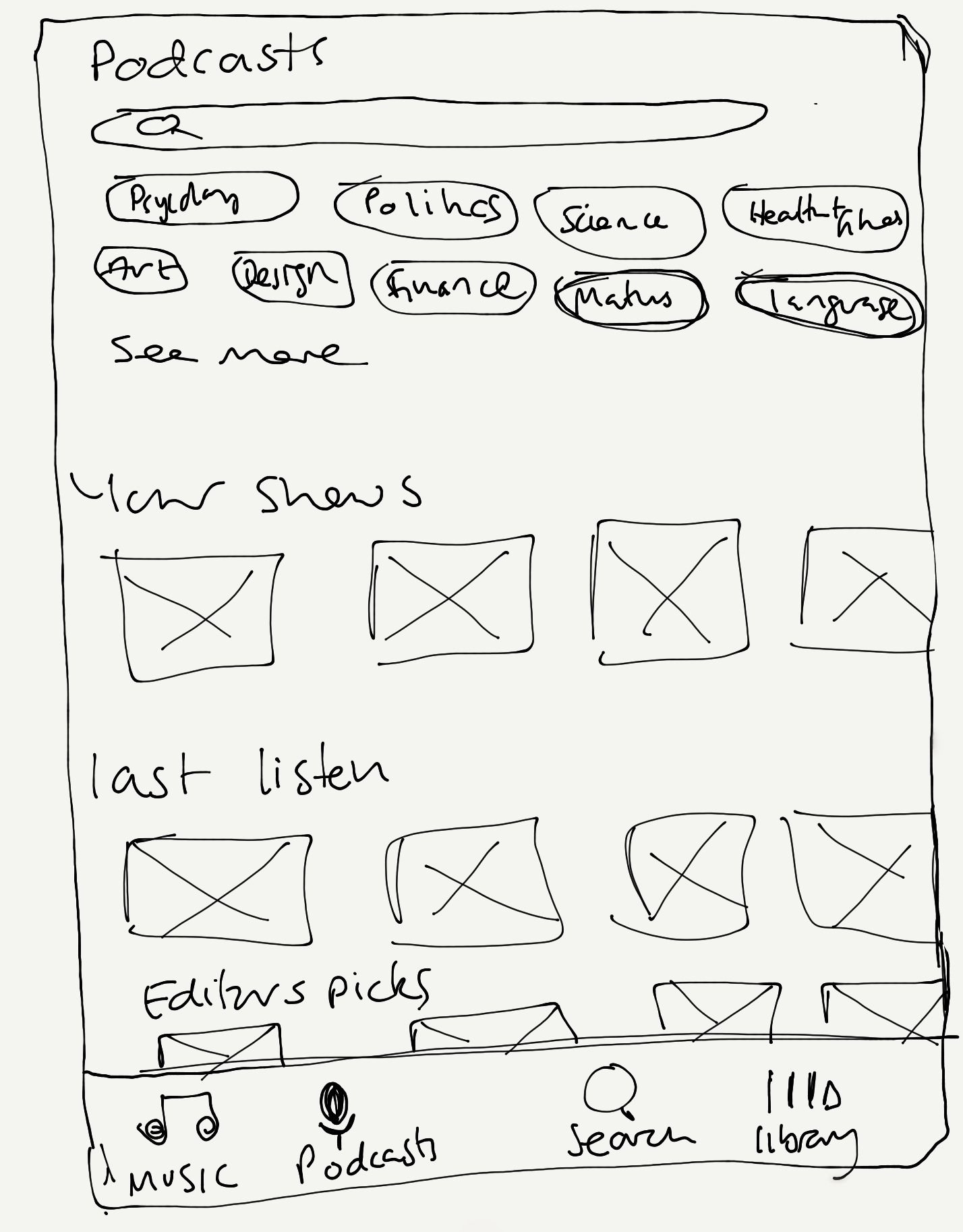
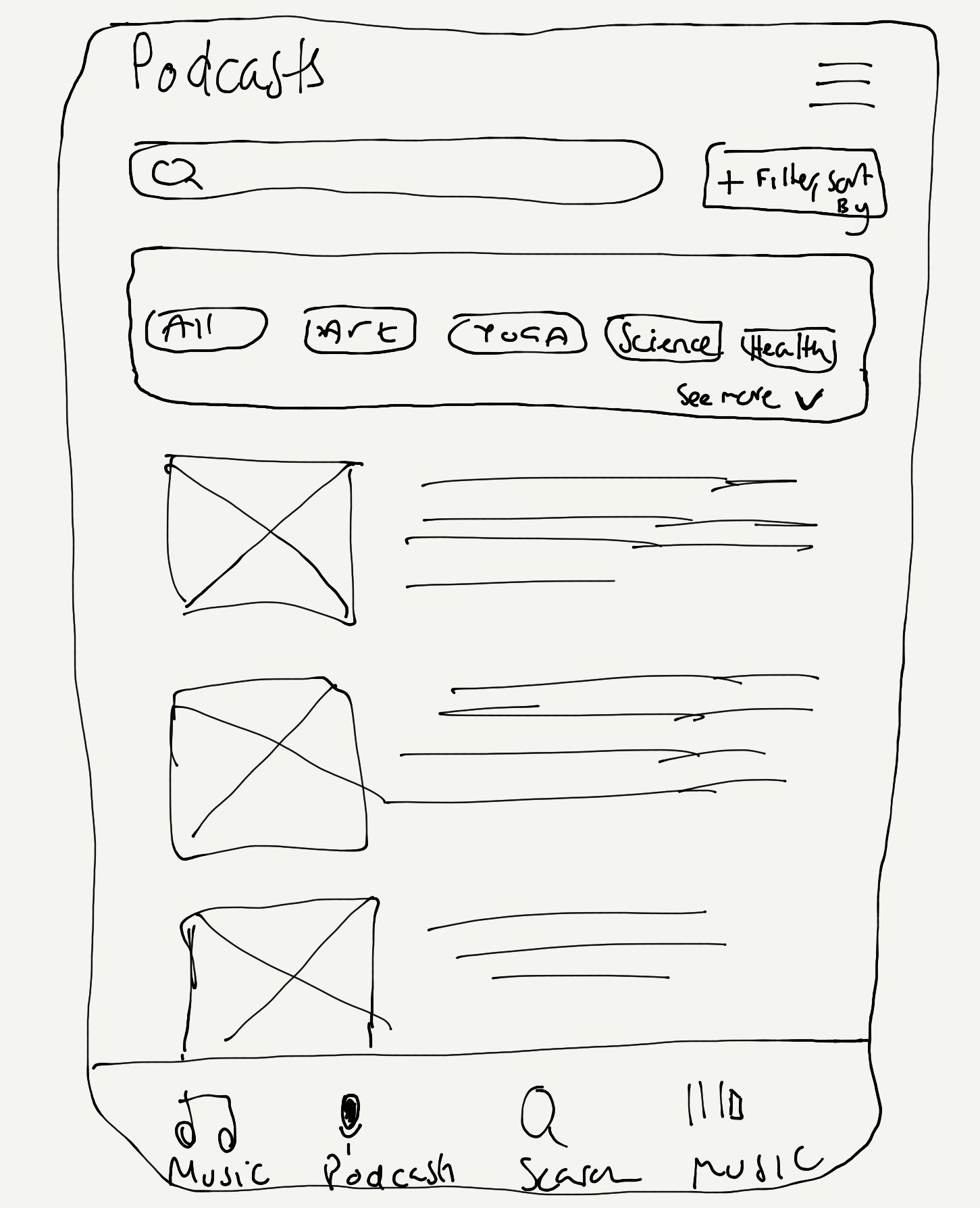
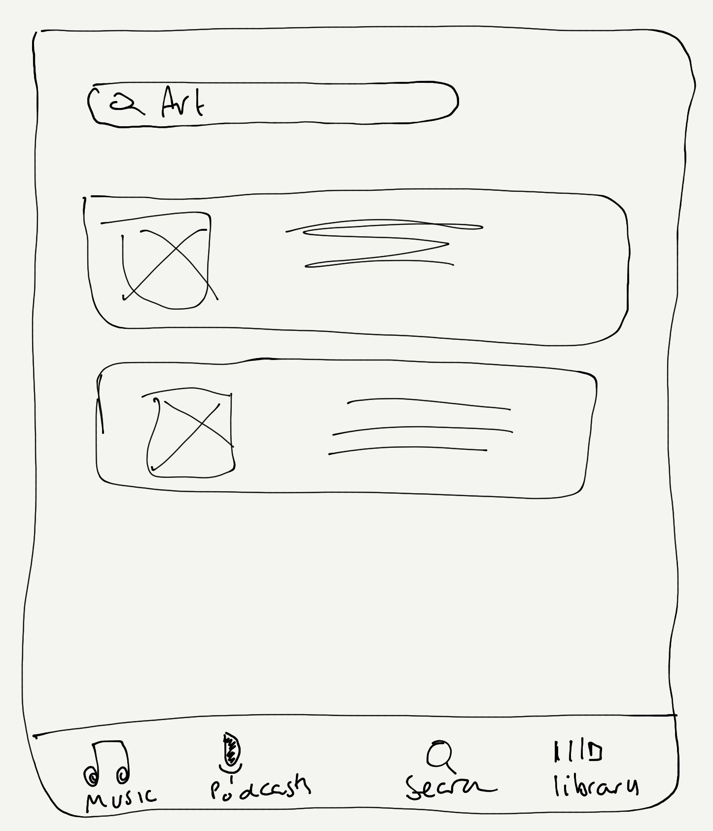
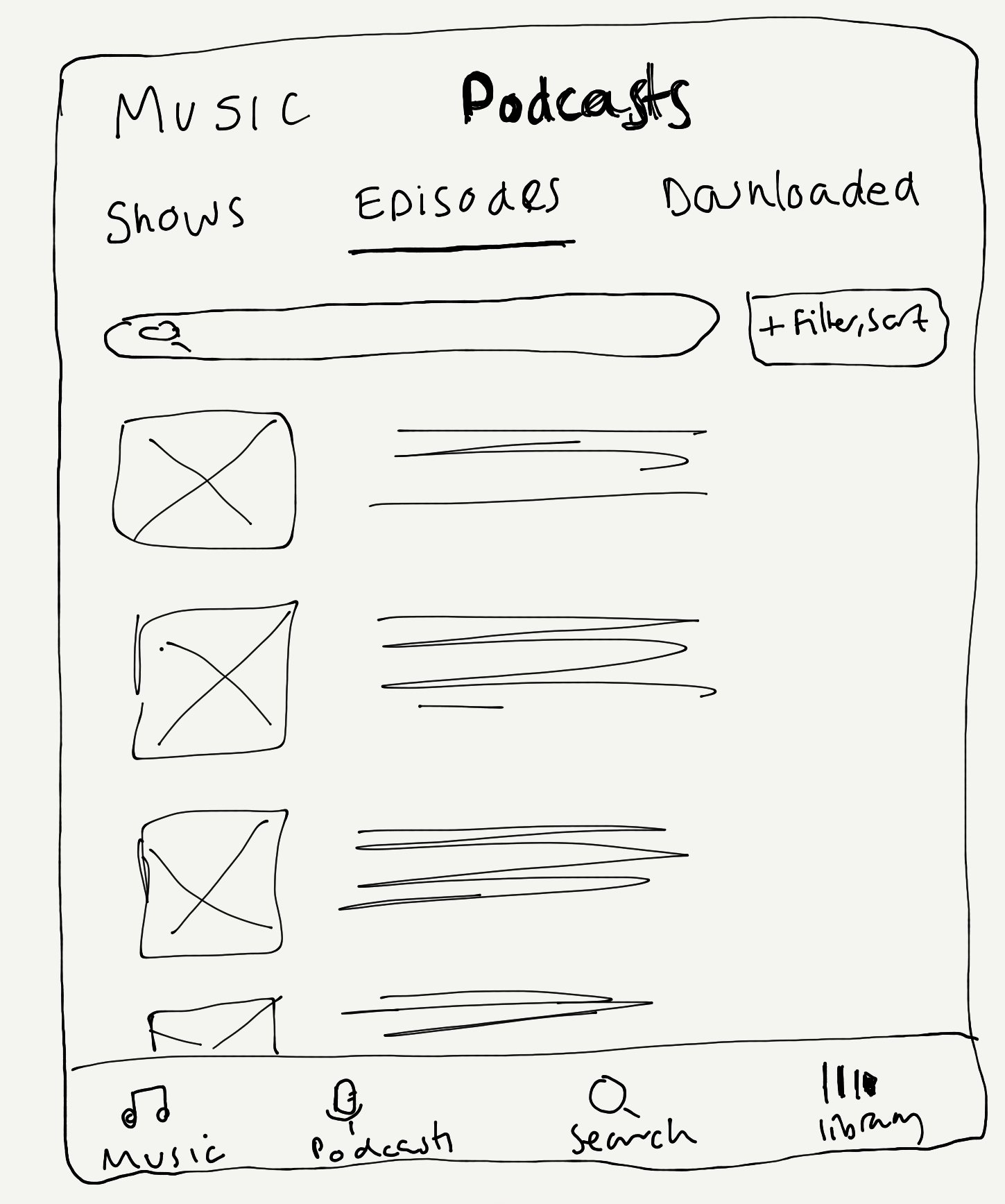
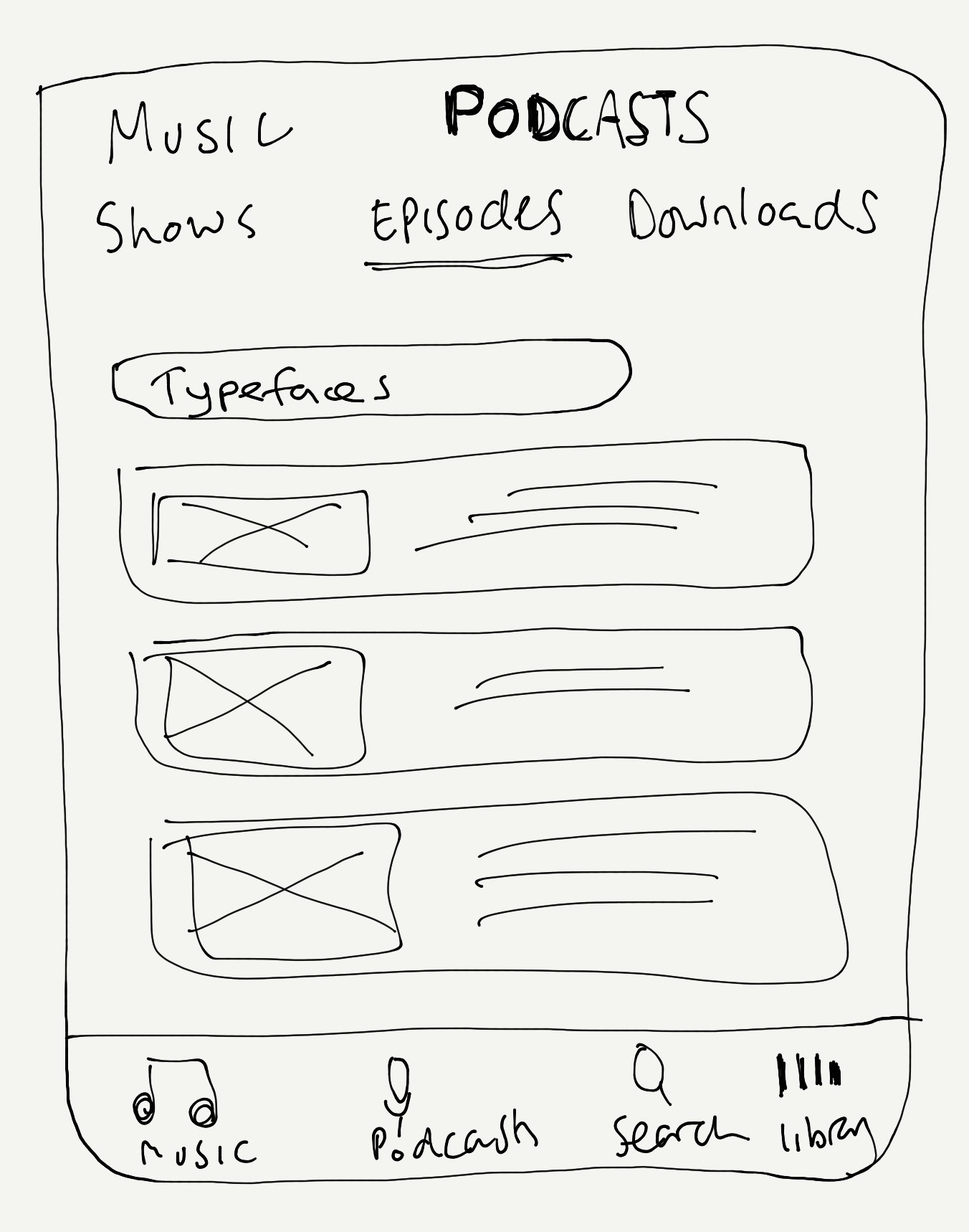
Sketches
The challenge, I needed to find a way to allow users to seamlessly move between music and podcast content that was clear and matched a mental model that exists in the real world.
I had originally thought of changing the home screen, but after sharing this with my group crit the feedback was clear. This would be a big change for users and I decided to find another way to allow users to get to podcast content.
I spent some time sketching out the screens so that I could ask for feedback from users. I was able to get some initial feedback from users who all agreed that if they could switch between podcasts and music it would make sense to them, also the idea of having a way to filter and search multiple things would be beneficial.
Wireframes
After gaining insight from a few users I was able to refine my approach to the problem, and this came in the form of a toggle to flip between podcasts and music, rather than having it in the navigation which was my original intention.
I was able to test out the option to have tags that allowed people to select multiple categories and this could refine the search to give them autonomy of their search.
High Fidelity
Staying true to Spotifys brand, I was able to design high fidelity screens that would allow me to test this new feature on users.
While I wanted to stay as close to the brand, some design decisions were made to enhance clarity and learnability for users for this new feature.
Prototype and Test
I tested the prototype on 5 users, I wanted to gauge their ability to navigate this new feature, and find out where there was friction within the task flow.
Initial observations from users was that they liked the toggle between the content, as this allowed them to focus on the task search podcast content. One user specifically said this is why they use Apple Music and Apple Podcasts as they can see the content separately (although they have to change apps), but that if Spotify had this option they would be more likely to switch to Spotify.
Filtering was clear, and felt familiar to users as this is familiar to them as used in other apps.
Prototype
Iterations
Based on the feedback, I was able to make the initial search and toggle switch clearer by increasing the size so that is was more obvious to users.
Feedback showed that users weren’t sure if they would know all of the possible guests or subjects on a show so I wanted to make that process simpler for the users, by having pre-populated filters. This would be something that the podcast creator could add since they would know, and could select from Spotify’s categories.
Reflections
Empowering The User
Due to the scope of the project, and time constraints, it made it easier to make a decision on the right feature to meet the users immediate needs. There were many directions I could have taken, but it was key that I went with something that would create the biggest satisfaction to users, and help build more data on user behaviour so that phase two we could start to serve up relevant content based on most used tags.
Removing Versus Adding Features
One of my observations about Spotify is that there is a lot of demand for new features on their community forum, and there is a real balance of adding versus removing features, or simplifying them. This is a real challenge for an App that serves such a vast community of users. If not careful can lead to feature bloat, and this can becomes distracting to users.


